Painting Historic Exteriors
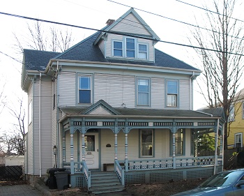
Before view of 28 Garfield Street
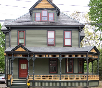
After view of 28 Garfield Street
Having trouble choosing paint colors that are appropriate to the age and style of your house?
The relationship between architectural style and paint color can be confusing. Understanding the style of your house, the paint colors and technology available during different historical periods, and how colors influence each other are helpful steps in choosing colors that are appropriate for the architectural style of your house and that work well together. The Historical Commission has a staff person with historic paint color experience who offers on-site consultations to homeowners anywhere in Cambridge to help with the paint selection process. The staff person meets with the homeowner at the house to discuss the history and style of the house, explain the aesthetics of the period during which the house was built, choose historically-appropriate paint colors for the exterior, and discuss the placement of the different colors on the building. The consultation fee is $75; this includes an initial one-hour on-site consultation plus a followup letter and later inspection of paint samples on the building. An additional fee of $75/hour will be charged for consultations that exceed 1-1/2 hours. Color consultations are free for properties located in Cambridge historic districts and for some properties protected by preservation easements because these properties are required to have their paint colors approved by the Historical Commission. For more information or to schedule an appointment, call (617) 349-4683 or TTY (617) 349-6112.
The Commission has written a guide, Painting Historic Exteriors: Colors, Application, and Regulation, to help homeowners and those who work in historic preservation achieve appropriate exterior paint color schemes for buildings of different periods and styles. Written in layman's terms, this guide discusses the changing uses of paint color and application over time, and provides guidelines for choosing paint colors, using multiple and accent colors, removing old paint, and painting outbuildings, fences, and porches. It also includes lists of appropriately-painted examples of each architectural style, diagrams of color placement, and tables of window sash colors by historic period. Painting Historic Exteriors contains 80 pages with illustrations and tables and comes shrink-wrapped and 3-hole punched ready to be inserted in a binder. The guide is available at the Cambridge Historical Commission office for $10 or by mail for $13 including shipping and handling. Click here for order form and instructions.
An excerpt from Painting Historic Exteriors follows below:
PRACTICALITIES OF PAINT APPLICATION
What’s Body, What’s Trim?
The correct answer to this question underlies all successful paint applications. Often, the placement of paint colors on a building is more critical to conveying the original sense of its design than the actual colors of paint used. Nearly all 19th and early 20th-century houses should be painted in three colors: 1) the body color, which is the color used on the main body of the house; 2) the trim color, used on all the decorative woodwork of the house; and 3) the sash and door color, used only on the movable parts of the windows and doors. A period-appropriate paint scheme is, with few exceptions, a three-color paint scheme.
The simplest rule for determining what is trim and what is body is to remember that only the main sheathing material (clapboard or shingle) is painted in the body color; all other woodwork is painted in the trim color. Trim woodwork is intended as a surrounding frame for the wall surface, thus trim pieces should always intersect and link up with other trim pieces; "dangling" trim (i.e., trim that does not appear to lie against or connect up with other trim) is probably not painted correctly. The sash and door color is the third color used on the building. Sashes and doors, which recess into the building, provide a psychological sense as well as an actual means of entry into the building. For most of the 19th-century, sashes and doors were painted in deep colors that drew the eye into the building and reinforced the perception of depth.
The Use of Multiple Body Colors
Using multiple body colors in a paint scheme might be compared to orchestrating a musical narrative: just as individual instruments will characterize a particular musical theme, each building component must carry a consistent color theme in order for the composition of the whole to be coherent. The key is consistency.
A house that has more than one major sheathing or siding material can have two body colors. A change in the major siding material indicates the original designer’s intent for a change in color as well. A good example is Queen Anne houses where a ground floor is sheathed in clapboards and the upper stories or gables are shingled. Wherever the second siding material appears, it is painted in the second body color; the use of the second body color then becomes the identifying characteristic of that material, building a "theme" that will ensure a consistent visual organization to the paint scheme as a whole. When two body colors are used, the trim color remains the same throughout the composition.
Finding two body colors that relate but can be readily differentiated by the eye and coordinating these two colors with a third color for the trim can be challenging. Frequently, the ground floor area will represent only about a third of the surface area of the house. Because it will be less prominent visually, the color used on the ground floor can be a darker or less appealing color than one would want to use for larger areas of the body. Because the ground floor is also the usual focus of the bulk of the trim (porches, bays), an unusual color on that portion of the body will be significantly relieved by extensive use of the trim color.
An exception to the use of a second body color is where the secondary sheathing material does not completely encircle the building or is not itself completely encircled with trim. While a field of contrasting color can be an important accent, for example, in a shingled gable end that is surrounded by moldings, if the secondary material directly abuts the main material, the resulting intersection of color will distract rather than accent. This situation often occurs on bays, which may be detailed with a shingled band that does not carry over onto the main body of the house. In such cases, using a second body color is not advised.
The Use of Accent Colors
As in the use of a second body color, the key to successful use of accent colors is their consistent application. Randomly painting details in a bright or contrasting accent color creates confusion rather than whimsy and may give the impression of a "magic marker" approach to applying color.
Accent colors can enhance unique detailing when used correctly but consider the entirety of the architectural presentation before deciding what and if to accent. Consider the features of the building that are truly unique and worth calling attention to: sunbursts in pediments, the astragal moldings framing the panels of a bay, or other ornament applied on top of, projecting from, or recessed within the main surface of the trim. Try to focus the accent color on a molding that circles the building completely, such as the bed molding that covers the joint between the fascia and soffit at the eaves of the roof, then apply the accent color to that molding everywhere it appears on the house, including, for example, secondary rooflines on bays and porches.
Avoid accenting standard or utilitarian components of the building such as gutters, band moldings on window casings, or porch floors. The band moldings that are applied to window casings will only be found on three sides of the window: the moldings stop at the sill. Accenting these band moldings is often suggested by painting contractors but results in an incomplete "frame" of color around the window and gives a choppy appearance. Similarly, features like gutters are hardly worth noting with an unusual or striking color accent.
A standard approach to accent color in the 19th century was to use the body color to highlight some areas of trim instead of adding a new color to the scheme. In this approach, the trim color is applied to all non-clapboard or shingled woodwork in the standard manner. Then the body color is applied to those areas of trim you have decided to accent. Again, consistency and restraint is the best rule.
Ask the painter to add the accent color after the main body and trim painting is complete, and then proceed cautiously once you have identified the elements to be accented. Accents can always be painted over in the trim color if they are too jarring.
Above excerpt taken from Painting Historic Exteriors: Colors, Application, and Regulation, Chapter II, pp. 1-3.
For more on window sash colors, order a copy of Painting Historic Exteriors, click here!